Thursday, June 29, 2023

Prevalence of Pictographs


Photo Credits: Unsplash

By Lilian H. Hill

In addition to visual and graphic literacy, a necessary skill today is the ability to decipher pictographs. A pictograph is a symbol used to communicate a word, phrase, or idea. You have seen them in road signs, icons on your smart devices, and many other situations. They can be used to illustrate numerical information and statistical data. They may stand alone or be incorporated into charts and graphs. Reading either text or pictograms requires that the brain abstracts information that represents spoken language. Pictogram and pictograph tend to be used as interchangeable terms. 

Pictographs in History

Pictographs are nothing new. Stone age rock paintings can be complex murals revealing stories about the makers’ spiritual beliefs (Kratz, 2019). Cave paintings made by ancient cultures also incorporate visual symbols. Pictographs were made by painting surfaces, while petroglyphs were made by incising markings into stone (Kratz, 2019). An interesting side note is that the visual form may be influenced by the substances used. Making marks in soft clay allows for curvilinear marks while incising symbols into stone forces the maker to use straighter lines. The colors of the marking were influenced by the available substances like minerals, gemstones, and dyes.

Some cultures used symbols, or pictographs, as their alphabet. Egyptian hieroglyphics used pictographs. Several modern alphabets are logographic, meaning that a symbol represents a word or morpheme, instead of alphabetic where letters represent individual speech sounds that make up a word. Those logographic symbols may be read either as pictures, as symbols for objects, or as symbols for sounds.  

Photo Credits: Unsplash

Importance of Understanding Pictographs

Pictographs have permeated our daily lives because they are used to convey instructions on medications, product labeling, transportation, safety labels, advertising, and as icons and emojis on computer screens. They communicate information in a visual mode that humans can quickly interpret. They are often used to convey written instructions, especially regulatory, mandatory, warning, and prohibitory information. They are useful when:


  1. The information must be processed quickly, for example in road signs.  
  2. Multiple languages are in use.
  3. People have low literacy abilities.
  4. Individuals have visual restrictions. They may be able to read a symbol more easily than print.
  5. A legal obligation exists to inform people for safety purposes.

A situation that requires informing people is the danger of mixing bleach with ammonia. I remember when our custodian mixed the two substances and the toxic cloud that formed. It can be deadly, and fortunately, the custodian survived. It happened because he was an immigrant who could not read the warning label written in English. The skull and crossbones symbol used to mean toxicity might have helped him to avoid the problem. This incident happened 40 years ago. Due to Occupation Safety and Health Administration (OSHA) requirements, it is doubtful that a person unable to read English would be allowed to work with chemicals today. 

Photo Credits: USP Pictogram Indicating Toxicity

Common Examples of Pictographs

A good example of a pictograph is the Wong-Baker Pain Scale that you have probably seen in a medical office. Originally designed for young children who would have a difficulty rating their pain on a scale of 1 to 10, the Wong-Baker Pain Scale incorporates faces with different expressions from happy (meaning no pain) to very unhappy (meaning extreme pain). Sometimes the scale is color-coded like stoplights, with green for calm and red for agitation. Health professionals quickly discovered that this tool was also useful for patients speaking multiple languages or those with low numeracy or numeracy.

You have also seen pictographs on prescription labels. The symbols are used to indicate ideas like “shake well,” “take with food,” “refrigerate,” or “take 4 times a day.” The U.S. Pharmacopeia (USP) Pictogram Library enables medical professionals to use standardized images to convey medication instructions, precautions, and/or warnings to patients and consumers. Pictograms are particularly helpful in passing on important information to patients with lower-level reading ability and patients who use English as a second language. Pictograms are available free of charge to professionals and patient information providers to reinforce printed or oral instructions. They are not meant to be used without verbal patient counseling.

Although thought to be universal, a study by Dowse (2000) found that the meaning people derive from symbols is influenced by culture. For example, some populations in South Africa interpreted the symbol for shake well on a medication label (lines going up on one side of a bottle and going down on the other side) as preparing to throw an object. The image of a prescription bottle was understood as a trash can. Another issue is that pharmacy pictographs incorporate assumptions about a lifestyle that can be problematic. Not everyone is able to consume three meals a day or is able to refrigerate their medication. What is someone who is homeless or skipping meals to make ends meet supposed to do?

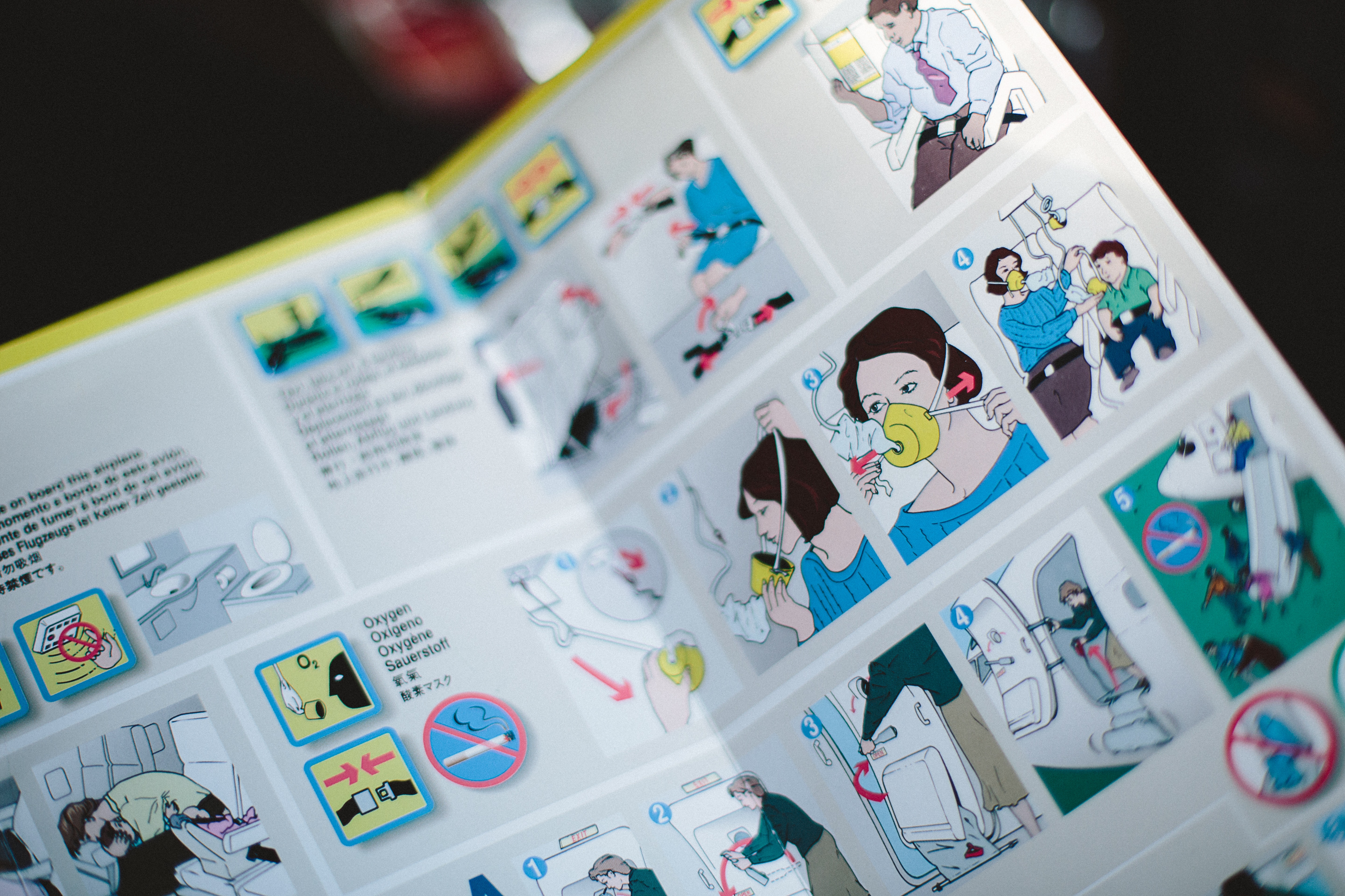
Another example of a situation where pictographs are used is an airline patient safety card. Containing very few words, symbols are used to depict the steps involved in using exits in emergency situations, buckling seatbelts, using air vents, donning lifejackets, and protecting young children in times of emergency.  This makes sense because people of many nationalities fly together.


Photo Credit: Unsplash

Company logos are another form of pictogram. Marketing companies use them to create brand recognition. For example, the double circles of the Mastercard logo are instantly recognizable, most of us recognize the Nike Swoosh and Target's red and white bullseye is well known.

Advantages of Pictograph Use

Five advantages of pictograph use are described below:

  1. Rapid interpretation. The human brain responds to and interprets visual information rapidly.
  2. Makes Information More Noticeable. People can scan and make meaning from visual images quickly and will recognize familiar warning symbols.
  3. Promotes Retention. Reading and interpreting pictographs use similar brain pathways. The brain also prioritizes visual information and links visuals with emotions, making pictographs easy to remember. People tend to retain 10 – 20% of written information and 65% of visual information.
  4. Helpful for People with Low Literacy. In public settings, people will vary from one another considerably. Given that a large number of people struggle with literacy, pictographs are used to convey critical information for health, safety, and information purposes.
  5. Cross-Cultural Communication. In settings where people of multiple cultures who speak different languages mingle, pictographs communicate essential information. For example, a traveler can recognize the symbol for the restroom in airports worldwide.

Disadvantages of Pictograph Use

There are 6 disadvantages discussed here, and there are probably more.


1. No Standard Interpretation. While many pictographs are commonly used and understood, there are many variations and interpretations can vary.
 
2. Pictographs Incorporate Assumptions. The pharmacy examples discussed above are one example of assumptions in pictographs.
 
3. Culture Influences Interpretation. Pictographs may be understood in ways that vary from their intended meanings by people of different cultures. In dangerous situations where the correct interpretation is vital, this can lead to confusion, injury, and even death.
 
4. Pictographs Lack Detail and Contextual Clues. Pictographs are simplified visual images and provide little detail and context. Even when accompanied by limited text, their meaning may not be clear.
 
5. Poor Quality Pictographs. Images that are fuzzy, pixelated, and disproportionally resized are difficult to understand. Overuse of common stock images for multiple purposes can cause confusion.
 
6. Proliferation of Pictographs. Many organizations and people are using pictographs. Software such as Visme allows the creation of pictographs for many purposes. The more pictograph images become available, the more opportunity for misinterpretation and confusion exists.

Are we too reliant on pictographs?

Some purists may argue that the proliferation of pictographs degrades language and literacy skills. Others would say that pictographs allow rapid communication in emergency situations, foster communication across cultures, support product branding, and assist people with low literacy skills.

References

Dowse, R. (2004). Using visuals to communicate medicine information to patients with low literacy. Adult Learning, 15(1/2), 22-26. https://doi.org/10.1177/104515950401500106

Kratz, J. (2019, October 24). Pictographs, etroglyphs, “Rock Art,” What is the difference? A blog of the US National Archives. Retrieved https://prologue.blogs.archives.gov/2019/10/14/pictographs-petroglyphs-rock-art-what-is-the-difference/

Tijus, C, Barcenilla, J. de Lavalette, B. C., & Meunier, J. (2007). The design, understanding and usage of pictograms. https://doi.org/10.1163/9789004253254_003

U.K. Department of Trade and Industry (2000). The role of pictograms in the conveying of consumer safety information. Retrieved http://www.ergo-eg.com/uploads/digi_lib/362.pdf

USP Pictograms. Retrieved https://www.usp.org/health-quality-safety/usp-pictograms


Sunday, June 11, 2023

Close Cousins: Visual Literacy and Graphic Literacy as Necessary Skills for the 21st Century


Photo Credit: Lilian Hill

By Lilian H. Hill

Our world is awash in signage and graphic images. Every day we are assaulted with a variety of images that include direction signs, instructions, framed images in our offices and homes, and advertising. This has been true for some time, but the volume and variety of visual and graphic images have increased tremendously in recent years.


It is not hard to see why. With the advent of personal photography and the rapid adoption of personal smartphones, anyone can take photos. High-speed wireless networks that can accurately transmit visual images, decreased data costs, and the presence of multiple social media platforms with which to share images enable people to more easily share and consume visual images (Kane & Pear, 2016). Graphics are used in marketing because they attract attention and enhance credibility. People are better able to retain visual information and images may be stored in long-term memory more easily than text (Kane & Pear, 2016).


Consumers are more likely to purchase a product that they can see (DesignHill, 2023). We are exposed to so many visual images and graphics that there are times when it becomes difficult to find the information we want among the visual clutter or “noise.”


According to the American Library Association (2011), “the importance of images and visual media in contemporary culture is changing what it means to be literate in the 21st century” (para. 1). The ubiquitous presence of images and availability of media that make it possible for everyone to create images, does not imply that people are equipped to interpret the meaning of images with a critical view.

Graphic Literacy

Graphic literacy refers to the ability of individuals to interpret information portrayed in graphs, tables, and charts. Writers often use these types of visual aids to help readers understand, interpret, and remember complex data. Graphic literacy involves our ability to: 


1.     locate and extract information from a chart.

2.     understand the information from the context provided in the chart.

3.     make meaning of information in the graph.

4.     apply the information gained from the chart or graph to make predictions. 


Examples of common graphics include tables, pie charts, bar graphs, line graphs, maps, coordinate graphs with x and y axes, decision trees, Venn diagrams, or concept maps. Other examples include floor plans, organizational charts, and work schedules. Many graphics will contain a legend that explains what symbols used in the chart are intended to mean. 


It is much easier to understand big-picture data than to gather details from a graphic. For example, statistical data can be dull and hard to read in sentences and paragraph form, so writers often use tables, charts, or graphs to communicate the results of a study. This helps readers to scan and interpret data more easily and quickly. However, it is important to know that readers should not rely solely on the data represented in a visual because some information may have been omitted to improve comprehension or to save space. That is why it is also important to read the text that explains the graphic.


Infographics

Graphics are sometimes called infographics, and they are a great way to represent information in a visual way. An infographic uses a combination of “information” and “graphic.” The infographic is a specific type of visual communication that includes graphics showing data, copy, or both. An Infographic is a collection of imagery that is often striking and eye-catching. They use only minimal text which is why it is important to read the text that accompanies the infographic. Infographics can be great learning tools because information is conveyed as both words and as visual images, thereby activating multiple neural pathways simultaneously.


Most of us learned the basics of reading and creating tables and simple graphs in math courses in school and college. More innovative charts include bubble charts, map charts, donut charts, gauge charts, geo charts, and many others. Software applications make it possible for even basic computer users to create sophisticated looking charts. Graphic tools built into Excel, Word, Google Sheets and other platforms are only the beginning. Google Charts contains 30 categories of charts you can use to create graphics. In addition, there are applications that will allow you to create a variety of graphic products such as Canva.com.


Graphic Examples

Beyond the basics of tables and graphs that people learn during their school years, several new graphic examples have been appearing in recent years. For example, a bubble chart is an extension of a traditional scatterplot; the size of the bubble represents the strength of the data related to each issue measured. The example below mixes a traditional table with a bubble chart. The bubbles represent the number of times political candidates 1, 2, and 3 mentioned an issue during an imaginary political campaign. The graphic does not represent what each politician said about the issues, whether the views they expressed about the issues were positive or negative, or whether their statements aligned with voters’ political views. It simply gives you an idea of the proportionate attention they gave to each of the issues listed in the left-hand column. From a graphic like the one below, you can quickly assess whether the candidates’ interests are parallel to your own, but you cannot ascertain their viewpoints. This example clearly demonstrates the importance of being aware of the capabilities and limitations of different types of graphic forms.

Frequency of Topic References

Image Credit: Lilian Hill


Some graphics forms such as concept mapping and mind mapping have specific software applications that can be downloaded and used, sometimes for free. The Sports Categorization Concept Map below was created using CMapTools, a software product used to create concept maps and it can accommodate both images and HTML links.

Concept Map Categorizing Sports (created in CMapTools)

Image Credit: Lilian Hill


The example below is of a decision tree related to the decision of whether to adopt a cat and the contextual issues that might be considered. 


Decision Tree for Cat Adoption

Image Credit: Lilian Hill


References

American Library Association. (2011). ACRL Visual Literacy Competency Standards for Higher Education. Retrieved from https://alair.ala.org/handle/11213/17223

DesignHill (2022, October 3). Top 7 Reasons why visual content will dominate in 2023. Retrieved  https://www.designhill.com/design-blog/reasons-why-visual-content-will-dominate/

Kane, G. C., & Pear, A. (2016, January 4). The Rise of Visual Content Online. MITSloan Management Review. Retrieved https://sloanreview.mit.edu/article/the-rise-of-visual-content-online/


Friday, June 2, 2023

Living in a Visual World: Visual Literacy


Picture credit: Lilian Hill

By Lilian H. Hill

Humans are a visual species, which is beneficial in a world dominated by images. The human brain can recognize a familiar object within 100 milliseconds, so when we see a picture, we are quick to analyze it. Bright colors capture our attention because our brains are wired to react to them. Our visual senses are by far our most active of the senses. Ninety percent of the information transmitted to the brain is visual. Visual images are processed in our brain 60,000 times faster than text (Trafton, 2014).

In addition to reading text, humans "read" visual information every day in traffic signs, pictographs, internet icons, in GPS maps, and many other symbols we see often. We easily make sense of them, even when they are presented in an unusual way. For example, once you learn the symbols for the male and female restrooms, we easily understand symbols that use centaurs for the men’s room and mermaids for the women’s room. Remember that the printed word is a symbol that represents language and language represents human experience. In the same way that written words are symbols, sports logos, road signs, thermometers, clocks, smartphones, and GPS maps are all symbols that we have learned to interpret.  


Visual Literacy

Visual literacy is the ability to read "visual text" effectively to find, interpret, evaluate, use, and create images and visual media. To be considered visually literate, people must have the ability to understand, appreciate, and create visual images and symbols to comprehend and share information. For example, is the danger in the image above from the octopus' arms or the manhole cover? Is an octopus really trying to escape?


Use Of Visuals

Visuals are used online and in print materials to capture viewers’ attention, to make text more interesting to read, tell a story, and improve readers' understanding of what they are reading. They are used in stories, movies, television, print advertisements, billboards, signage, video games, informational videos, blog posts, and social media. Advertisers carefully study about what best captures viewers’ attention. The material that best attracts viewers’ attention and is most likely to prompt action is content with low cognitive demand and high clarity (Hernandez, 2021).


Optical Illusions

Despite our strong visual senses, the human eye can be fooled or tricked. Think of the common visual illusions such as the two portraits that can also be a vase, or the portrait of the old woman that can also be viewed as a young woman. For the image below, did you see the butterfly first or the multiple profiles?


Photo Credit: Unsplash


Altered Images

Have you ever taken a photo and edited it on your phone? If so, you understand how pictures can be easily changed to convey different meanings. Even the tone of a picture can create different meanings.  Consider the three images of dried flowers below. It is the same picture, but the colors used can really change emotional reactions to an image. The center image is the actual, unretouched photo, the left-hand image is in black and white, and the right-hand image has pink overtones. Consider how your mood changes when viewing the three images. 


Photo credit: Lilian H. Hill


One way that images can be altered relates to the way they are located in a photo. A close-up view reveals a lot of details about an object while a more distant view provides information about the context about where an object is placed, and its relative size compared to other objects. We can be fooled into thinking that an object is larger or smaller than it is in real life. 


Photo Credit: Unsplash


Some technologies, such as Photoshop, can produce visual images that cannot happen in real life. A good example is the image above of the large man "high-fiving" the tiny woman. Many advertisements alter their images to make products look better. They may change the lighting, use filters, or even fake a product. Did you know that the whipped cream you see in advertisements is really shaving cream? Shaving cream is used because it withstands heat better than whipping cream under hot studio lights.  If you try an internet search for “badly photoshopped images,’ the results can be entertaining. Next time you see an advertisement, ask yourself is the model’s waist really that small, are her legs that long, is her skin that fantastic? Are his shoulders really that broad, is he really that tall or muscular? Where did that extra hand come from? 


Visual Image Standards

It is interesting to look at the Associated Press standards for visual images which are copied below. The Associated Press (AP) is an American non-profit new agency headquartered in New York City. It operates as an independent organization dedicated to promoting truth in the press. Its membership is composed of U.S. newspapers and broadcasters. It produces news reports, radio broadcasts, and images that are distributed nation-wide and globally. The standard are below.


  1. AP visuals must always tell the truth.
  2. We do not alter or digitally manipulate the content of a photograph in any way. Changes in density, contrast, color and saturation levels that substantially alter the original scene are not acceptable.
  3. Backgrounds should not be digitally blurred or eliminated by burning down or by aggressive toning. The removal of “red eye” from photographs is not permissible.
  4. We do not stage, pose or re-enact events.
  5. When we shoot video, environmental portraits, or photograph subjects in a studio care should be taken to avoid misleading viewers to believe that the moment was spontaneously captured in the course of gathering the news.
  6. In the cases of portraits, fashion or home design illustrations, any intervention should be revealed in the caption and special instructions box so it can’t be mistaken as an attempt to deceive.


Source: https://www.ap.org/about/news-values-and-principles/telling-the-story/visual

References

Hernandez, S. (2021, October 25). How to get the most visual attention on your content. Retrieved https://www.socialmediatoday.com/spons/how-to-get-the-most-visual-attention-on-your-content/608678/

Trafton, A. (2014, January 16). In the blink of an eye: MIT neuroscientists find the brain can identify images seen for as little as 13 milliseconds. MIT News, Retrieved https://news.mit.edu/2014/in-the-blink-of-an-eye-0116


AARP Publishes Annual Fraudwatch Issue

  Image Credit: Markus Winkler, Pexels By Lilian H. Hill Financial fraud and scams encompass a wide range of deceptive ...